
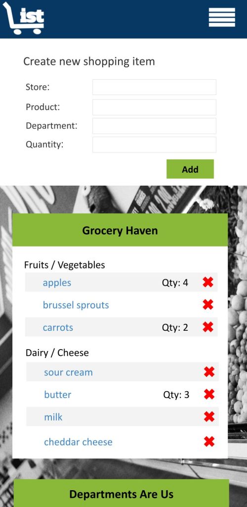
Trish’s Shopping List
What I Love About It:
This project was born out of a personal need for a better-organized grocery shopping app. My favorite part of the design was the department-sorting feature, which allowed users to customize their shopping lists based on their local store layout, making the entire process far more efficient.
My husband built the app using NodeJS, and together we spent many late nights crafting it. We collaborated on every detail, from functionality to design, always striving for a solution that would simplify our lives.
When Google Shopping List came out, we shelved our product since it mirrored much of the functionality we had developed. However, as often happens with tech, Google’s initially perfect solution slowly turned into a frustrating experience. So, we’ve decided it’s time to re-release our app, complete with all the features we loved and a few improvements to address the issues we learned from the first go-around.
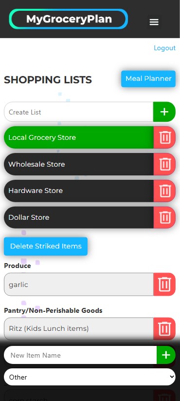
Mygroceryplan.ca
What I Love About It:
This project has evolved far beyond its original purpose. What started as a way to organize grocery trips has become MyGroceryPlan.ca — a powerful, web-based meal planning and grocery list platform designed to make real family life easier.
As my career shifted and I began working full-time, the responsibility for cooking and grocery shopping shifted too — and my husband suddenly found himself relying on the very app we had built together. It was during that transition that one of our best new features was born: the ability to attach recipes directly to each meal plan. This simple addition made it effortless for us to share responsibility in the kitchen. Either of us can now open the app, see what’s planned for dinner, view the recipe instantly, and jump right in without a second thought.
Today, MyGroceryPlan.ca focuses on what actually matters: quick meal planning, dietary filtering, one-click shopping lists organized by department, and seamless collaboration between anyone sharing the task of feeding a household.
The result is a tool designed for real families — to reclaim time, reduce decision fatigue, and make daily life run a little more smoothly.

Little Dragon Gets Heartburn
What I Love About It:
This project was the perfect blend of my love for storytelling and illustration. I spent hours at the playground picnic table, sketching characters while my kids played nearby. I especially enjoyed reading the story to the community children, hearing their reactions as they laughed at the dragon’s misadventures. The rhyme of the story flowed naturally, and I poured a lot of heart into getting the little dragon’s expressions just right—capturing everything from confusion to surprise as he encounters the consequences of his fiery mistake.
What I really love about this story is the message it conveys: mistakes are an important part of learning. The story reflects how, as parents, we try to protect our children from making the same mistakes we did, but ultimately, those lessons are theirs to learn—even if it’s the hard way. It’s a theme that resonates with me as a parent, and I wanted to capture that truth in a way that would be both relatable and enjoyable for kids.
Inspiration
The initial spark for this story came from my son’s innocent, yet brilliant, “You know what would be funny?” moment. He imagined a dragon with a fire stuck in its mouth, unable to put it out. At just five years old, he became an integral part of the creative process, helping me revise and brainstorm ideas. One of my favorite moments was when he insisted on including a scene where a tree catches fire, which made its way into the final version of the book. His excitement and imagination were the driving force behind Little Dragon Gets Heartburn, and his contribution turned it into a story that’s truly special to both of us.
Simply Amazing Worksheets
Simply Amazing Boxy Font & Simply Amazing Traceable Font
What I Love About It:
Simply Amazing Worksheets was born during the COVID-19 lockdowns as I searched for creative and engaging ways to keep my children learning while at home. Unable to find the perfect tracing worksheets, I decided to create my own educational tools—this is where the Simply Amazing Boxy Font and Simply Amazing Traceable Font came to life.
The Boxy Font is a bold, childlike font designed to bring a fun, playful touch to educational materials, while the Traceable Font is a dotted font that allows children to trace letters and practice their writing. Together, these fonts formed the foundation of Simply Amazing Worksheets, offering parents and teachers a complete set of tools to engage young learners.
Inspiration:
The idea for these fonts came from my desire to make learning more enjoyable for my children. I wanted to design something functional and fun that would encourage them to practice their writing skills. With Simply Amazing Boxy Font adding a whimsical element and Simply Amazing Traceable Font providing the structure for learning, I was able to create a set of worksheets that my kids loved—and many others found helpful during remote learning.
Scoliosis Alberta
What I Love About It:
The Scoliosis Alberta project was both a challenge and a learning experience for me. The initial design I built for the site was completely different from the current version—and the client wasn’t happy with it. After receiving their feedback, they provided me with brand guidelines for the first time in my career. These guidelines completely transformed how I approached the design. With clear direction, I was able to create a website that aligned with their vision and mission. This project taught me the value of starting with solid brand guidelines as a foundation for design, and since then, I’ve made it a point to request them before beginning any project.
This website is a crucial resource for people newly diagnosed with scoliosis, helping them navigate the complex process of treatment and support. Ironically, years after building this site, my husband was diagnosed with scoliosis, which deepened my appreciation for the work I had done and the people this organization helps.
Inspiration:
The client’s dedication to helping individuals with scoliosis inspired me to create a design that was both welcoming and informative. I wanted the site to be easy to navigate and to make visitors feel supported from the moment they landed on the page. Working with their brand guidelines helped me achieve that balance, ensuring the site communicated their mission clearly while maintaining a professional, compassionate tone.
Learning Experience:
This project was a turning point for me in my design process. I realized how essential it is to start with a clear understanding of a client’s branding and visual identity. The brand guidelines not only helped the design process but also made communication with the client smoother and more efficient. Now, every project I undertake begins with a thorough review of brand guidelines to ensure the design is aligned with the client’s expectations from the very start.